
使用css的border边框属性和宽度高度可以实现各种形状的图形,如下:
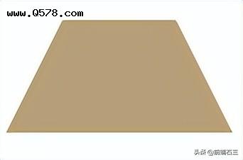
梯形
梯形
html:
css:
/*梯形*/.trapezoid { width: 80px; height: 0; border: 40px solid #fff; border-top: 0 solid; border-bottom: 80px solid #b4a078; }
五角星
五星
html:
css:
.star-5-points { width: 0; height: 0; position: relative; margin: 50px 0; border: 80px solid rgba(0,0,0,0); border-top: 0 solid; border-bottom: 56px solid red; transform: rotateZ(35deg); } .star-5-points::before { content: “”; width: 0; height: 0; position: absolute; top: -36px; left: -52px; border: 24px solid rgba(0,0,0,0); border-top: 0 solid; border-bottom: 64px solid red; transform: rotateZ(-35deg); } .star-5-points::after { content: “”; width: 0; height: 0; position: absolute; top: 3px; left: -86px; border: 80px solid rgba(0,0,0,0); border-top: 0 solid; border-bottom: 56px solid red; transform: rotateZ(-70deg); }
带子形状
html:
css:
.ribbon { width: 0; height: 80px; border: 40px solid #56ad66; border-top: 0 solid; border-bottom: 28px solid rgba(0,0,0,0); }
钻石形状
钻石
这个图形由2部分组成,当上部图形的背景色比下部背景色浅时就会有点立体效果,如下图。
html:
css:
/*上部图形背景色*/.masonry { width: 50px; height: 0; position: relative; margin: 20px 0 82px; border: 25px solid rgba(0,0,0,0); border-top-width: 0; border-bottom-color: #b4a078; }/*下部图形背景色*/ .masonry::after { content: “”; width: 0; height: 0; position: absolute; top: 25px; left: -25px; border: 50px solid rgba(0,0,0,0); border-top: 70px solid #b4a078; border-bottom-width: 0; }
心形
心形
html:
css:
.heart { content: “”; display: block; width: 100px; min-height: 80px; position: relative; transform-origin: 50% 50% 0; }/*左边形状*/ .heart:before { content: “”; display: block; width: 50px; height: 80px; position: absolute; top: 0; left: 50px; border-radius: 50px 50px 0 0; background: #ff66ff; transform: rotateZ(-45deg); transform-origin: 0 100% 0; }/*右边形状*/ .heart:after { content: “”; display: block; width: 50px; height: 80px; position: absolute; top: 0; left: 0; border-radius: 50px 50px 0 0; background: #ff66ff; transform: rotateZ(45deg); transform-origin: 100% 100% 0; }
心形由左右2个形状组成,如下图:
去掉after的样式就会看到这个图形
去掉before的样式就会看到这个图形